Case study

The interviewing experience
I set the experience direction for a structured interview intelligence product that fills the gap in existing hiring workflows.
This case study tells the story of how I designed and built a key area of the product; the interviewing experience.
You spend 2–6 hours with a candidate. You can’t assess everything. You need to make the best use of that time to ensure you assess the most critical things.
This is fundamental to the whole product, not just this feature.
The assessment gap
Applicant Tracking Systems (ATSs) do a great job of tracking the candidate life cycle, but they do a poor job of facilitating accurate assessments of candidates.
Interviewers and candidates go into a black box and often a hiring decision comes out the other side with scorecards unfilled and no evidence of how a decision was made.
Evidenced was built to address that issue, by allowing interviewers to:
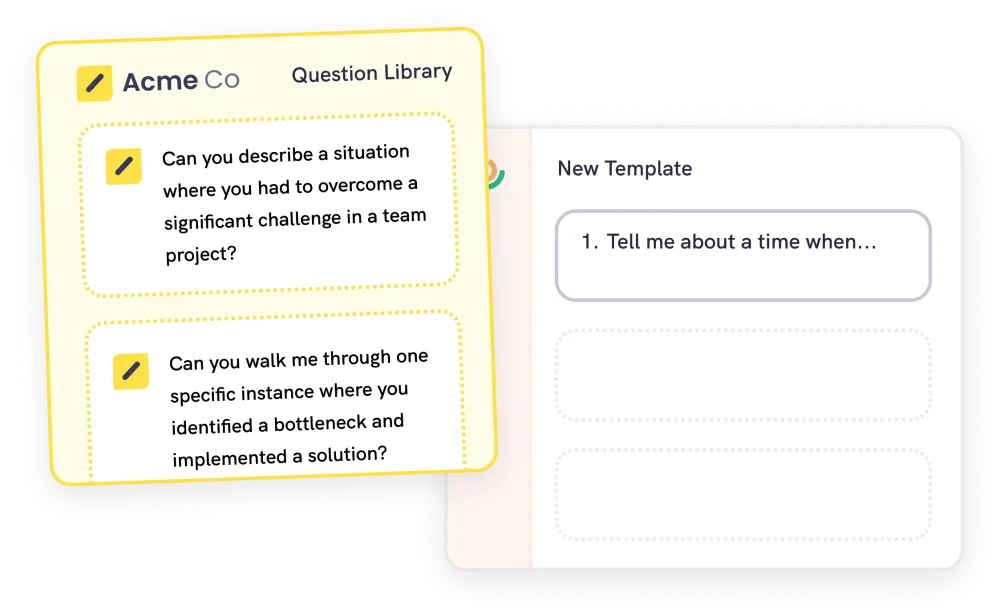
- Select the right things to assess, the skills and competencies that actually matter for the role.
- Assess rigorously, without bias, measure each candidate against those competencies consistently, basing decisions on evidence rather than gut feel.
- Prevent losing candidates to a bad experience, a poor interview loses you the people you most want to hire.
- SourceATS
- CV screenATS
- Interview & assess
- OfferATS
The interview & assessment stage
- 1. SelectSkills & competencies to assess against
- 2. InterviewCapture evidence in real time
- 3. DecideEvidence-based hiring decision
Experience design principle
An unstructured hiring process creates gaps where bias and poor judgment can creep in. For example, skipping a question because you think you already know the answer or being influenced by the first interviewer’s opinion.
The job of the experience is to close those gaps without making the interviewer feel policed, and without compromising the candidate’s experience of talking to a human. This principle is present across the product, but specifically in these three places:
Designing the interview experience
Early on I discovered that interviewer groups interacted with the experience in different ways:
High volume, interviewing all day, building muscle memory, time-pressured. The risk is the UI gets in their way.
Low volume, dropped in irregularly, often with no training. The risk is the UI under-supports them.
Interface design decision
I chose to build a single interface, optimised for the hiring managers and panel interviewers, who needed more guidance.
Experienced TAs often want to skip questions because they feel they already have signals and want to reject candidates early. But that is exactly where the bias enters and why the product exists.
The structure isn’t there just as a guide for the inexperienced. It’s acting as a behavioural intervention for everyone.
It’s hard choosing not to build what your most vocal power users request, but sometimes building it would destroy product value you’re most confident in.
The interview lifecycle
The interview experience handles three connected phases of the interview, each of them has a different job.
Coordination
Getting the interviewers ready for the interview and reassuring the candidate.
Guidance
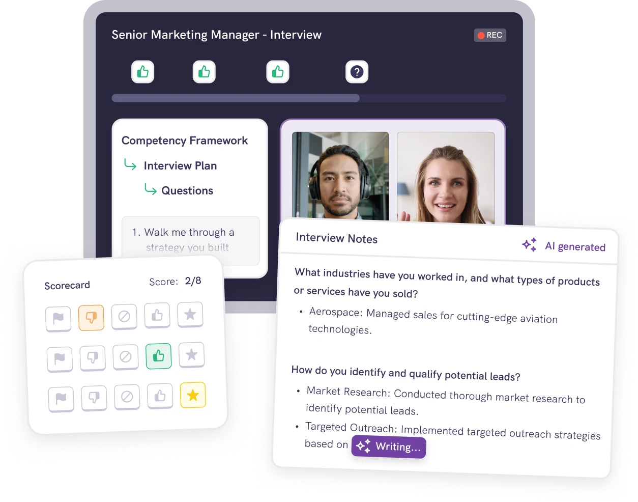
Supporting the interviewer, capturing the evidence as a record.
Recall & judgment
Tools to help you quickly review the interview and make a decision.
Designing the interface
There was no design-to-engineering handoff on this. I designed the interface in Figma, then built the frontend myself in production on a feature branch. Then I wired it up with the founders, who built the backend and data layer.
I like working this way as it collapses the usual gap between the design and the thing that ships. Especially on complex features like this one, where there are many moving parts. I’d rather resolve them in code rather than deferring them to someone else’s interpretation.
Since the initial release of the interviewing experience, AI-assisted development has allowed me to move even faster. For anything involving interaction, state, or motion (where a static Figma frame was always an approximation of the real thing) I now tend to explore directly in the codebase rather than in a design tool.
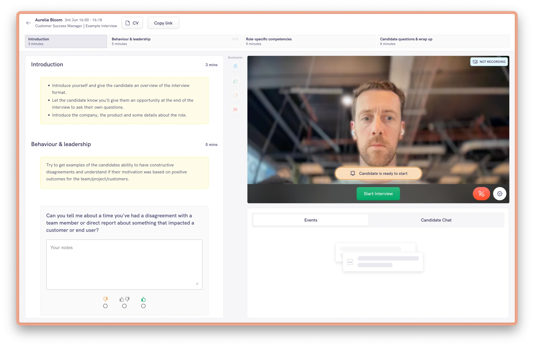
Part 1: Pre-interview (coordination)
Before the interview starts, the screen is about orientation. Familiarising yourself with what you need to ask, who's going to ask it and then waiting for the candidate.
The screen is made up of four main areas:
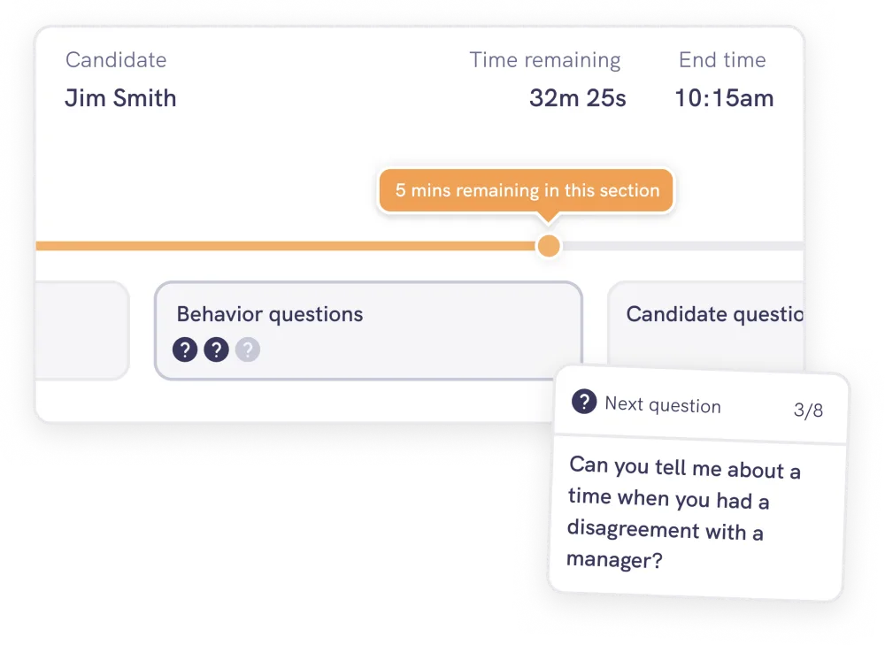
- The interview structure in a timeline at the top (sections and time allocated to each).
- The interview questions and note taking areas.
- A side channel for interviewers to talk to each other before the candidate enters.
- The candidate in a waiting room who has to be let in deliberately.
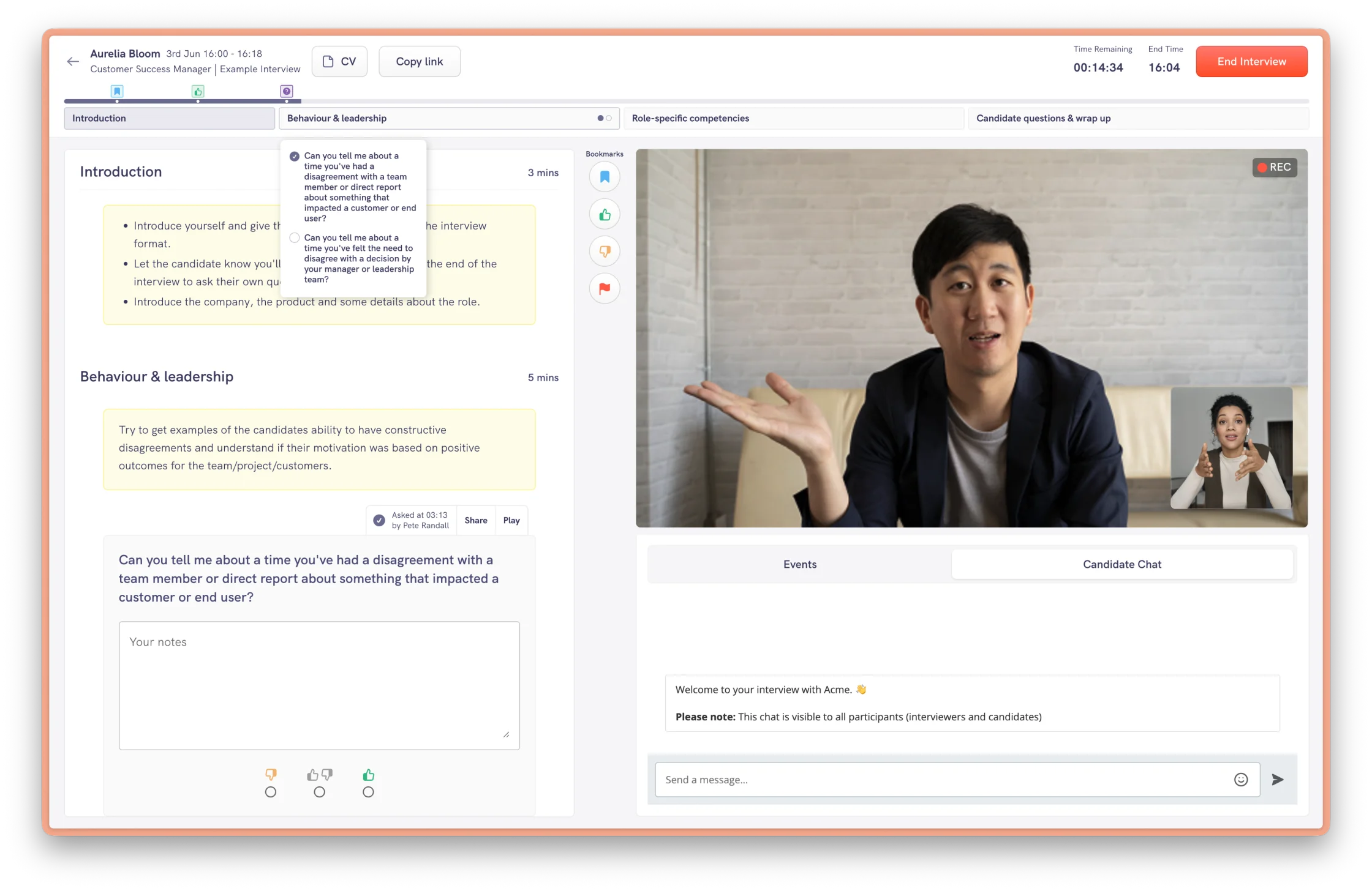
Part 2: Live interview (guidance)
During the interview, the UI supports the conversation. The candidate’s experience is the highest-priority and we don’t want to distract or overwhelm the interviewer.
That’s why I kept the interface minimal. The timeline captures the questions asked, bookmarks, moments to revisit. Notes attach per question, the countdown flags if you overrun, and the transcript stays hidden by default so it doesn’t become a distraction.
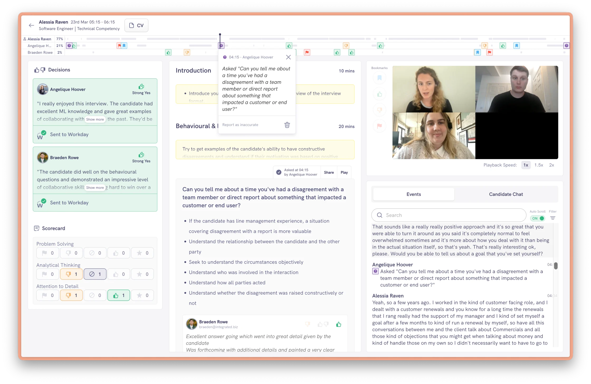
Part 3: Post-interview (recall & judgment)
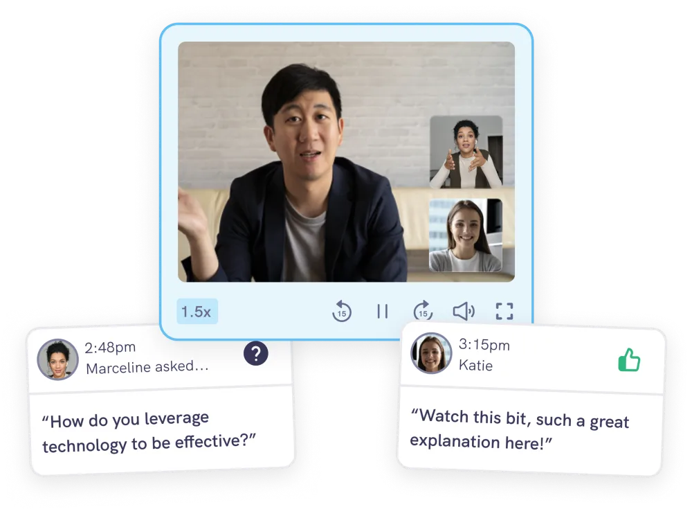
When the interview ends, the interface changes to focus on the post-interview process. The AI extracts the key information against each question and the recording becomes something you can navigate using the main timeline element at the top of the screen.
A key decision here was ensuring that other interviewers’ notes and decisions stay hidden until you submit your own. This protects independent judgment, and it’s a deliberate break from how most ATSs work.
Handling commercial complexity
The experience had to work for very different customers, from small startups to large enterprises. These have different budgets and different appetites for features like AI and interview recording.
Some enterprises weren't ready to turn everything on. So I designed the interface in a modular way, with key parts of the experience able to be toggled on and off per customer.
That design decision is what made tiered pricing possible. Working with the founders, I used it to shape a packaging model that let us close deals with large enterprise accounts who needed to start small.
It also gave accounts a path to grow. As customers adopt more features they move up a tier, which has helped turn one-off sales into multi-year contracts.
Validating the solution
Evidenced has a small customer base and is a high-touch B2B product. Therefore I chose research methods suited to small numbers rather than metrics for statistical validation.
- Dogfooding on our own hiring, we ran our own interviews on the product, which helped us identify issues before releasing it to customers.
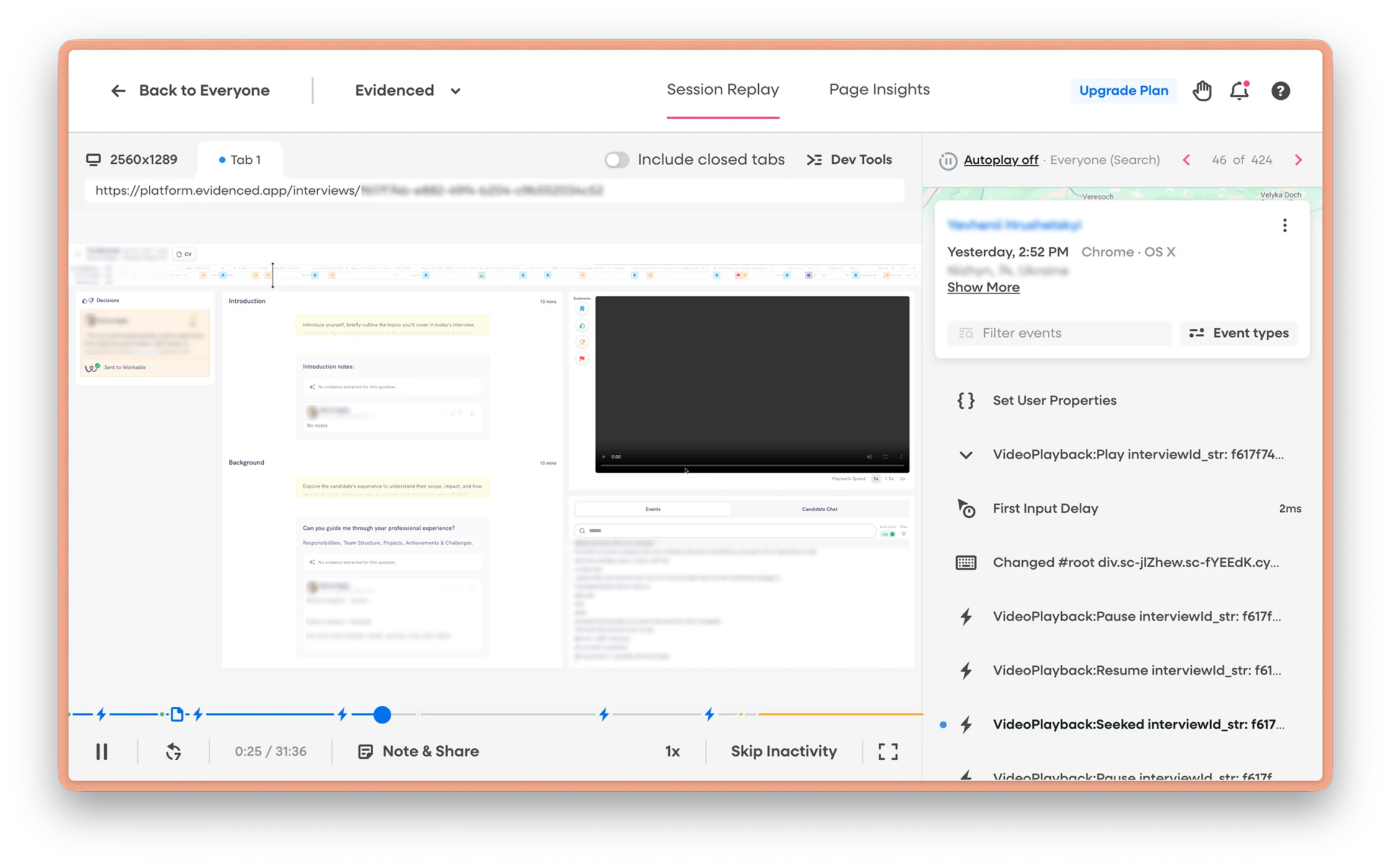
- Session-recording review (FullStory), watching real interviewers showed me where the UI was distracting and where it was working. Watching interviewers in action was the only way to observe the real-world behaviour.
- Structured customer interviews and CS calls, direct qualitative signal from our daily users about pain points and areas for improvement.
The future of the interviewing experience
The explosion in AI usage has had a significant impact on structured interviewing.
On one side, candidates using AI during live interviews can reduce the effectiveness of the assessment. If you can’t tell whose thinking you’re evaluating, the evidence is worth less. That pushes the product towards assessment built on real work and real scenarios, which is harder to fake.
On the other, AI is now part of how people actually work. So assessing how well someone uses it has become a skill in its own right, and that’s where I’d be investing.